Logo Design as a Visual Identity for the Semarang "OLSEN" Coffee Shop
DOI:
https://doi.org/10.55732/jikdiskomvis.v9i2.1462Keywords:
Brand awareness, Brand identity, Logo, Visual identityAbstract
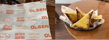
“OLSEN” is a very new coffee shop in Semarang. This design aims to visualize the identity of the “OLSEN” coffee shop. The logo design is based on a unique selling proposition (USP), which is elaborated with the business development concept: a coffee shop with a family feel. In identifying the USP, the qualitative descriptive analysis method of strengths (S), weaknesses (W), opportunities (O), and threats (T) or SWOT is used. The data used is primary data collected through interviews and observations. Starting from the basis of the USP, the logo developed is a type of logotype with a choice of bold San Serif capital letters and an orange color choice. The logo is made minimalist to give a light, homey, and friendly impression. The logo is added with the slogan "Caffeine Supply" to give a unique and contemporary impression and is not generic. The minimalist logo design was chosen because the “OLSEN” coffee shop is a coffee shop that has not been operating for long, so the logo is expected to make it easier for consumers to remember the “OLSEN” coffee shop.

Downloads
Published
Issue
Section
License
Copyright (c) 2024 Journal of Computer Science and Visual Communication Design

This work is licensed under a Creative Commons Attribution-ShareAlike 4.0 International License.


